I was very pleased with my tutor feedback for assignment three. I chose to capture a narrative based on the Belfast Continental Market, and carried out great planning and preparation for this task. I feel that all my research prior to shooting resulted in a well structured and well photographed assignment that was of a high standard. My tutor agreed with this, and I was delighted with his comments. Below you will find some of my tutor’s positive and negative comments, along with any changes which were implemented in accordance with these.
Positive Feedback
“The assignment conveys a good sense of the atmosphere of the market with imagery that shows very good conceptual progression. The images show development in your approach and the positive effect on your image making of your researches.” I feel that this highlights how my work is improving throughout this module, and emphasises how my research prior to photographing impacted positively upon my photographic work.
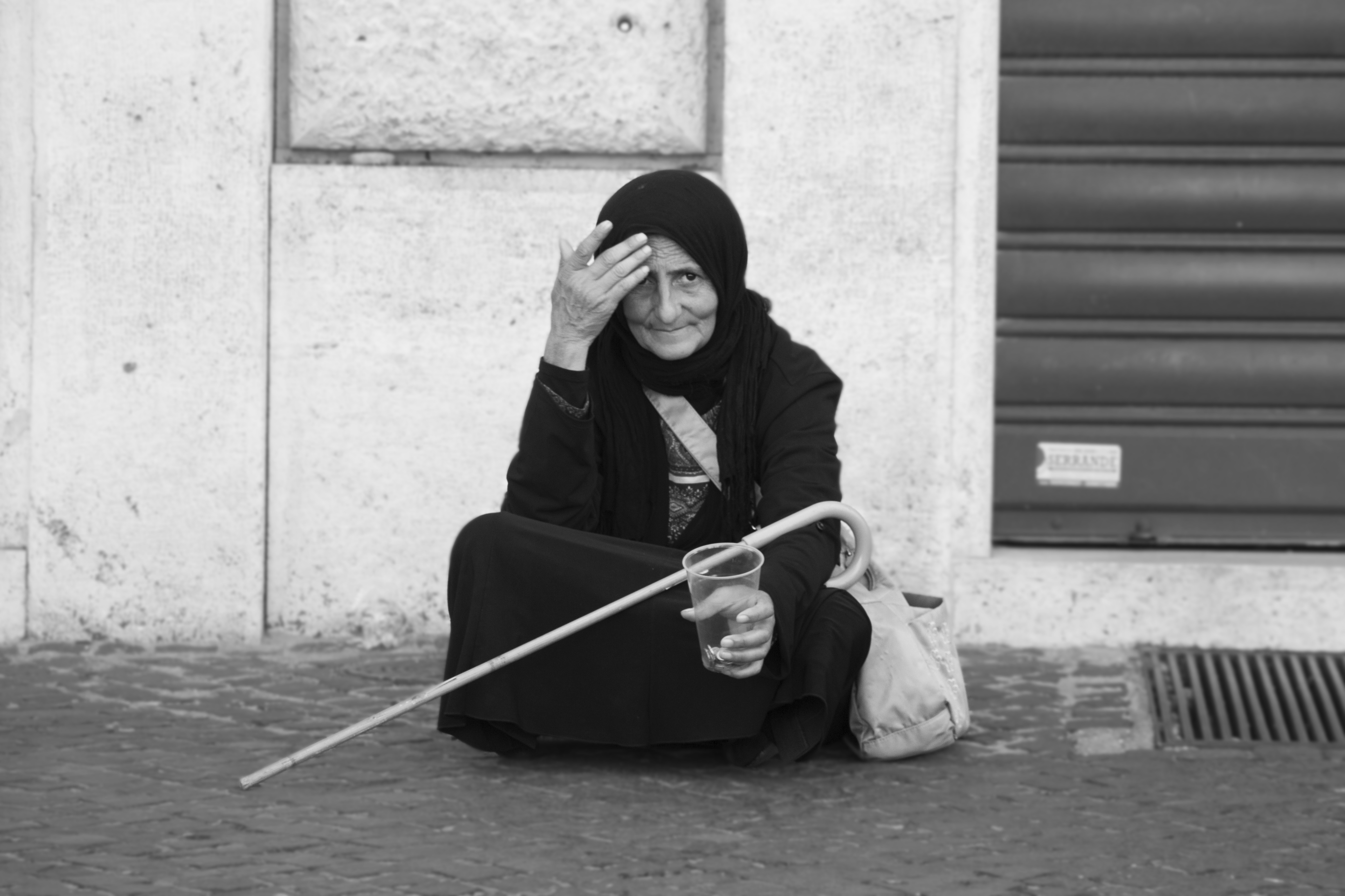
Image 2-

“Of the stall holders I think this is your strongest image. It’s not a conventional moment that most people casual photographers would choose; it’s much richer and more engaging. Well done!” I loved this image, and so was very pleased with this comment. I feel that my own unique style and perspective is beginning to burst through in my work, and this is shown through this image.
Image 6-

“The burger shot is very atmospheric with the steam and smoke and in tribute to Winogrand feels very New York and candid. It’s another strong one in the series in terms of evocation. It’s making me hungry!” This image is a strong example of where my research prior to photographing paid off. Using tips from fellow photographers such as Winogrand, I was able to produce an evocative and atmospheric image that gave a great sense of the feel of the event.
Images 7&8-


“They’re a strong pair which again show how your research has moved on your image making and the efficacy of using a wide angle and getting in close. The second one of the character is glasses is the most sophisticated image you’ve produced on this module so far.” Again, very high praise from my tutor which truly encouraged me forwards in my documentary photography. I took a few risks within these images; using a wide-angle for image eight in order to get in close to the subject. I feel that coming out of my comfort zone when photographing street photography really works to improve my imagery; and these comments are proof of that.
Negative Feedback
Image 3-
“This is one of the ones that I feel could have benefited from a bit more processing. The cheese in the foreground is rather blown out and the shadows in the background rather blocked up, so I’ve used the Shadows/Highlights control on it, overall and selectively to put more tone into the highlights and more detail into the shadows. I’ve also cropped it a bit tighter to lose some distracting extraneous things just clipping the edge of the frame.” I took this advice on board, and made the suggested changes to improve the quality of the image. You will find my before and after images below.
Before:

After:

Image 4-
“I think the ‘pasta moment’ was well chosen; he’s looking at it as if he’s wondering what it is that he’s pulled out of the water. Again perhaps a little more shadow detail is in order.” I made the following changes to the shadow detail in accordance with this comment. Please find my before and after versions below.
Before:

After:

My tutor was pleased with my narrative flow throughout, feeling that there was a strong connection between the images, and that they portrayed the theme well. However, he felt that the final two images would have been stronger had they also been food related.
“We are presented with the theme which ostensibly seems to be visually about food, eventually we see two people eating the food but apparently in a different location and then we go back for a couple more non-food stalls. Having established the focus as food then from a thematic narrative point of view it might have been better to stick with the making, selling and consumption of food; with more shots of people eating distributed through people preparing and selling. I think that would have seemed to have more of an intention, a story about food consumption. The last two images, while being effective in their own right seem like part of a different story.” I loved my final two images; and whilst upon reflection, I agreed that I could have chosen a food consumption theme and ran it throughout, this was not what I had planned and prepared for, and thus to change the images now would be to remove my honest experience and view of the event. The market was very much centred around food, but there was definitely a great deal of crafts and other stalls available; so to portray anything other than this would be to do the event itself an injustice. I feel that I photographed the event exactly how I saw it, and how I feel that other visitors would also see it, and therefore this was the narrative which I portrayed.
Final Tutor Comments
Good research that has really improved your outcome in terms of image making and approach; often students don’t manage to really reflect their research in their finished results, you have. Well done!
To conclude, I feel that this was one of my strongest assignments thus far, and I am extremely pleased with the comments and feedback given by my tutor.
For further reference, you will find my tutor’s feedback in full below.
Overall Comments
The assignment conveys a good sense of the atmosphere of the market with imagery that shows very good conceptual progression.
Feedback on assignment
The images show development in your approach and the positive effect on your image making of your researches.
It’s a very good introductory image, the character is open and friendly, addressing us directly and welcoming us to the series.
The head set and the stall tells us a lot about the situation already.
It was a technically challenging situation which on the whole you’ve handled very well, getting what was important to get sharp in focus.
The series could have amounted to a lot of ‘to camera’ portraits of the stall holders, good for the first image but variation was needed and you’ve supplied that in the second image and I think this is one, as you say, where the influence of your research particularly shows.
Of the stall holders I think this is your strongest image. It’s not a conventional moment that most people casual photographers would choose; it’s much richer and more engaging. Well done!
The next one transcends the typical portrait because of the boar’s head in the top right corner.
This is one of the ones that I feel could have benefited from a bit more processing.
The cheese in the foreground is rather blown out and the shadows in the background rather blocked up, so I’ve used the Shadows/Highlights control on it, overall and selectively to put more tone into the highlights and more detail into the shadows.
I’ve also cropped it a bit tighter to lose some distracting extraneous things just clipping the edge of the frame.
I think the ‘pasta moment’ was well chosen; he’s looking at it as if he’s wondering what it is that he’s pulled out of the water.
Again perhaps a little more shadow detail is in order…
I think the paella is the weakest shot both in composition, interest and technical quality. Also the sudden change to a portrait format is jarring.
One can use that as an intentional effect to give one’s audience a jolt but in general it’s best to maintain the same, if not very similar, aspect ratio through a whole series.
The burger shot is very atmospheric with the steam and smoke and in tribute to Winogrand feels very New York and candid.
It’s another strong one in the series in terms of evocation. It’s making me hungry!
The two eating shots have a very different feel to the rest because the preceding ones feel night time and closed in whereas with these we’ve been chucked out into the street and surprisingly it’s a bright cold day.
They’re a strong pair which again show how your research has moved on your image making and the efficacy of using a wide angle and getting in close.
The second one of the character is glasses is the most sophisticated image you’ve produced on this module so far.
A point on the previous one; the sky is blowing out in the top left hand corner so the frame is bleeding into the border. A quick fix for this condition is to reduce the white point to 247 with the Levels control.
In terms of sequencing I’m not sure whether putting them together is the best strategy or not. I can see they make a buffer between the food counters and the other sorts of goods.
I think this points out a weakness in terms of narrative flow…
‘Present your viewer with the theme, further developments and complications and, finally, a resolution…’
We are presented with the theme which ostensibly seems to be visually about food, eventually we see two people eating the food but apparently in a different location and then we go back for a couple more non-food stalls.
Having established the focus as food then from a thematic narrative point of view it might have been better to stick with the making, selling and consumption of food; with more shots of people eating distributed through people preparing and selling.
I think that would have seemed to have more of an intention, a story about food consumption.
The last two images, while being effective in their own right seem like part of a different story.
Learning Logs or Blogs/Critical essays
Good research that has really improved your outcome in terms of image making and approach; often students don’t manage to really reflect their research in their finished results, you have. Well done!